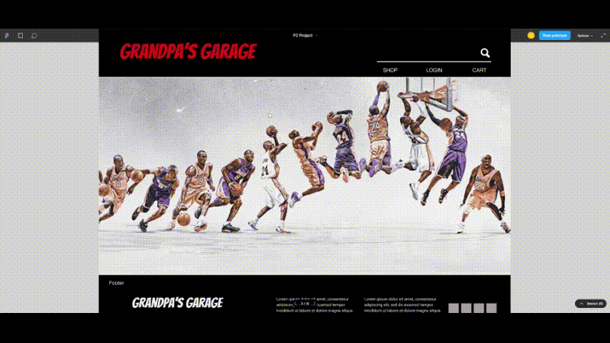
GRANDPAS GARAGE
DESCRIPTION
Grandpa's Garage has been a family-owned business for over 50 years. Originally established as a small brick-and-mortar store, it offered a unique selection of sports memorabilia, collectibles, toys, and apparel. Today, the business proudly serves customers through its online platform as well.
The company's mission is to deliver the best possible online shopping experience. With ongoing efforts to enhance the website, Grandpa's Garage ensures a secure and enjoyable shopping environment. Its distinctive product selection, knowledgeable team, and prompt shipping make it a go-to destination for collectors and shoppers alike
PROBLEM
Grandpa’s Garage has been in the game—literally—for over 50 years, becoming a go-to pro when it comes to sports memorabilia and collectibles. Over the years, their collection has grown bigger than a '90s baseball card binder, with all kinds of cool stuff joining the lineup.
Now here’s the kicker: how do they deliver that same top-notch, white glove treatment from their old-school shop to the wild world of the internet? Because let’s be real—it's a little harder to hand someone a mint-condition rookie card with a smile through a screen.
TEAM
Jet (me) sole project owner
MY ROLE
UI Designer, User Research & Interviews, User Journey Map, Affinity Mapping, Persona, Wireframe Sketching, User Flow, Logo/Icon Design, Wireframing, High Fidelity Prototype, User Testing
PLATFORM
Desktop
GENRE
E-Commerce
OVERVIEW
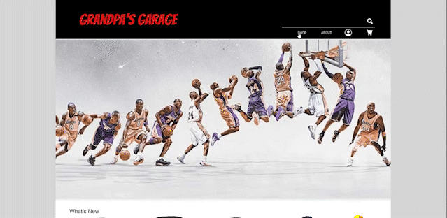
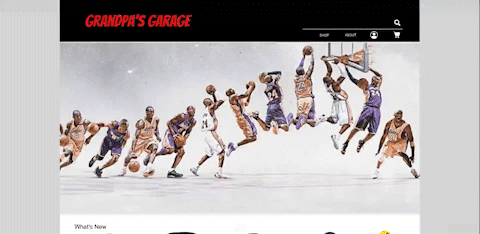
Grandpa’s Garage got its start way back in 1943 as a cozy little shop in El Monte, California. What began as a simple love for collecting sports memorabilia turned into a full-blown passion project—and over the years, it grew into an online store packed with sports cards, toys, games, and apparel.
Fast forward to 2022, and Grandpa’s Garage officially went digital. The goal? Keep that same old-school charm and top-notch service, just with fewer shelves and more clicks. The website was built to make shopping a breeze—it's easy to use, nice to look at, and made for fans new and old. Whether you’re a lifelong collector or just looking for something cool, they’ve got you covered—with fast shipping, great service, and a whole lot of heart.
DISCOVER
DISCOVER
DEFINE
User Interview
Participants Survey
User Persona
Journey Map
Problem Statment
How Might We
DESIGN
TESTING
Pre Usability Test
Post Usability Test
Mid Fidelity
High Fidelity
Prototype
The Goal
Take a good look at the website to see if it’s actually as user-friendly as it claims to be. That means checking if people can easily find their way around using the basics—like the main menu, search bar, filters, and product categories—without getting lost or clicking in circles.
You’ll also want to test out the search function to make sure it gives back useful results (and not some random unrelated stuff), and see if users can tweak their search without any hassle. Oh, and don’t forget the checkout—make sure it’s quick, smooth, and doesn’t make people want to toss their phone across the room. The goal? A simple, easy, and painless shopping experience from start to finish.
The Approach | Contextual Observation
I had 5 participants who all share a love (and a pretty solid knowledge) of collecting or buying toys and collectibles. To get a better idea of what might be tripping users up, I ran a Contextual Observation session—basically, I watched how they interacted with the website in real time to spot any pain points or confusing moments as they browsed around.
DEFINE
Customer Journey
.jpg)
"
"
I’m lost in their Navigation Bar, they’re using words that I’m not unfamiliar with.
"
"
The images were unclear and I’m not sure if I’m purchasing the right item
Identifying Errors
Non-Intuitive Navigation Bar
Navigation bar is missing its common features. It lacks categorization which makes it difficult for users to search for product on the website
It also uses jargons of words which are unfamiliar for regular consumers to undesratnd

Identifying Errors
Product Gallery Opportunities
Product Gallery uses low quality images
Multiple images is not available for customer to see different views of the product

Identifying Errors
Product Image Opportunities
Product Image View uses low quality images
Lacks of information about the product


Bio
Meet Felix a 30 year old guy from Arcadia CA. Felix enjoys a lot of sports including Basketball, Baseball and Football. He also likes collecting Sports items like Memorabillias, Toys and other collectibles.
Challenges
Felix wants a website that is easy to navigate and effecient in finding items he wants to to purchase
Behavior
During his spare time he browses online to search for stores within his area that he can visit physically and virtually (e-Commerce), look for itemsHowever, he preferres purchasing his sports items online, for him its mobile, concentrated, informative and convenient.
Goals
Accuracy and Efficiency
Inventory
Aesthetics
Architecture

Brands

Problem Statement
Users finds it difficult to find products using it’s essential tools on the website. It lacks features that are common in navigation bars to improve the searching capability of the tool. Also, the site uses jargon words that are unfamiliar to regular users.
"How Might We..."
How might we be able to redesign an existing website that would help the customers to find products and items more effectively and efficiently?
How might we be able to redesign an existing website that would help the customers to find products and items more effectively and efficiently?
DESIGN
User Task Flow
Goal 1: Purchase 1x product using the Home Navigation Bar

Goal 2: Purchase 3x product using the Home Navigation bar

Goal 3: Purchase 1x products using the Product Gallery’s Faceted Navigation Bar

Site Map
Using a Site Map, I was able to outline multiple categories which are aligned to the products available in their inventory. I bucketed each category in to subsets based popular item or titles

Comparative and Competitive Analysis
To get the best from the rest, I compared Granpa’s Garage with other competitor to see if we have all the features combined to make our website more intuitive

Sketches
After I had a clear direction from our User Task Flow, Site Map and C&C, I begin sketching the Home Page, Navigation Bar and Product Gallery to come up with the most optimal solution


Mid-Fidelity

To validate the effectiveness of my design, I conducted some testing's on the new and old websites, to see if we have addressed the areas of opportunities and improved our users experience

Addressing Errors | Enhanced Navigation Bar

NEW

-
6 MAIN Category and 24 SUB Category all static visibility
-
Occupies 20% of the screen real-estate
-
Drops down when CTA is clicked
-
Translucent
OLD

-
8 MAIN Category and 7 SUB Category
-
Jargons
-
Static in Nav Bar
Addressing Errors | Enhanced Product Gallery

Faceted Navigation
The Product Gallery houses different types of products, and it’s easy for users to get frustrated if it’s difficult to search for specific items. To mitigate this, we added a Faceted Navigation bar, so our users can easily sort items by categories, to save them time and frustrations

NEW

-
High quality and larger image
-
Clean fonts and title
OLD

-
Uses jargons and unfamiliar words
-
Uses screenshot and low-quality images
Addressing Errors | Enhanced Product View
NEW
-
High quality and larger image
-
Product description available
-
Cleaner arrangement of fonts


OLD
-
Low quality images
-
No product description
